Share this blog:
After the approval of the first Bitcoin spot ETFs this year, digital assets have reached the public markets which marks a remarkable milestone for a nascent technology that has been changing the world's perspective on financial assets. The ETF now enables wealth managers, public and private institutions, retirement and pension plans, and traditional financial investors to exchange dollars for crypto. The Bitcoin ETF is not likely to be the first and last digital asset ETF, with applications for Ethereum ETFs already hitting the SEC’s doorstep.
On the back of this expanded market and booming asset class, Amberdata is excited to announce the launch of our market intelligence platform AmberLens. Built with the market's deepest and most granular data, these metrics are available now through AmberLens. Elevate your research, asset management, and trading strategies with metrics and insights commonly used in traditional financial markets. AmberLens also offers dashboards into stablecoins, Bitcoin ETFs, and Ethereum networks, with more metrics and insights coming soon.
In this report, we will explore how institutions focusing attention on Bitcoin can leverage Amberdata’s new Bitcoin Market Indicators to understand the forces driving Bitcoin and market trends. AmberLens also offers insights and dashboards such as BTC ETF Flows, stablecoin stability, and Ethereum network metrics. The datasets used to build each dashboard are available through AWS S3, Snowflake, and Google Analytics Hub. For more information, please schedule a demo here.
Market Top/Bottom Indicators
Price and Moving Averages
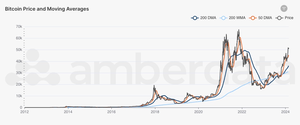
Bitcoin price, 50DMA, 200DMA, and 200WMA
The starting point for Bitcoin is most often price. Using daily and weekly moving averages, we can track the price of Bitcoin along with support, resistance, and trendlines. For example, using the 50-day moving average (50DMA) along with the 200-day moving average (200DMA), we can see that the 50DMA fell below the 200DMA in September 2023. This pattern is frequently called a death cross, which signals price weakness and historically precedes price rebounds. These types of moving averages are often short- and mid-term price indicators, and are commonly used in traditional financial applications.
Pi Cycle Top Indicator
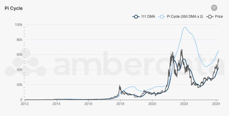
Bitcoin price, 111DMA, and Pi Cycle (350DMA x2)
Another price trend indicator is the Pi Cycle Top Indicator. This indicator consists of the 111-day moving average (111DMA) and a 2x multiple of the 350-day moving average (350DMA x2), referred to here as the Pi Cycle. This indicator is often monitored as a price behavior to signal when the cycle has overheated or is heating up. The former is determined when the 111DMA has reached the Pi Cycle, and the latter is based on the gap between the two increases. Historically, this metric has had success in identifying the top of the cycle.
Realized Cap
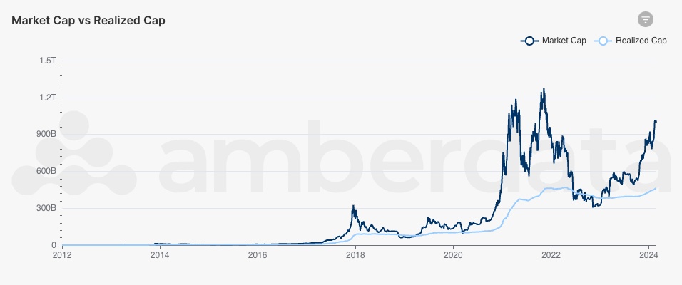
Bitcoin’s Realized Capitalization and Market Capitalization
Realized capitalization is an expansion of market capitalization. Where market capitalization is a function of supply and price, realized capitalization is a function of supply and last moved price. When UTXOs (unspent transaction outputs) are spent, their value is realized based on the price at that time. Therefore, the realized cap is the aggregation of all UTXO’s realized value. Realized cap can also represent the value of all coins in the network and can serve as an aggregate cost basis for the network.
Given the methodology to calculate this metric, older UTXOs have a significant weight on the realized cap given their age and the lower price at which they last moved. When older tokens move, the lower price of those tokens is then re-valued at the new price and can create a large shift in the realized cap.
Historically, when the realized cap is greater than the market cap, the network is out of profit and is in an aggregate loss. On the other hand, when the realized cap is less than the market cap, the network is in profit and is in an aggregate profit.
MVRV Z-Score
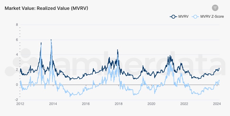
Bitcoin’s MVRV and MVRV Z-Score
The MVRV Z-Score is a comparison between the network’s market value and realized value. These indicators give us an assessment of Bitcoin’s realized value relative to its fair value, and have historically indicated that when the market value (numerator) is significantly higher than its realized (value) – the indicator is high – the market is at a top, whereas a low indicator tells us that the market is undervalued – market value is significantly lower than realized value. The MVRV Z-Score predicts top and bottom prices at the extremes of market conditions.
Reserve Risk
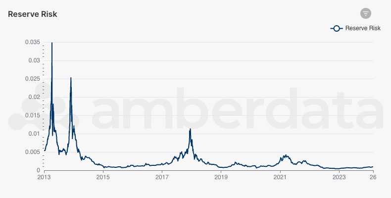
Bitcoin’s Reserve Risk
Reserve Risk can be interpreted as a confidence score of long-term holders. When confidence is high and the price is low, Reserve Risk (low value) can indicate that it is a good time to buy – buying when reserve risk is low generates oversized returns. However, when confidence is low and the price is high (reserve risk is a high value), the indicator is a sell signal – there is too much risk. Recently, Reserve Risk has been low, indicating that it might be a good time to accumulate.
Bitcoin Yardstick
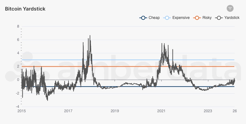
Bitcoin Yardstick
The Bitcoin Yardstick is a metric for Bitcoin that attempts to measure the price-to-earnings (P/E) ratio, which typically measures the value of a company's profits to its earnings. P/E ratios help us evaluate how valuable a company's stock is and are often used as a metric of comparison to other stocks. For Bitcoin, that is the perceived value of the network over the value of energy used to maintain it.
There are three notable conditions:
- Cheap: Yardstick < -1σ under the mean
- Risky: Yardstick > +2σ above the Mean
- Expensive: Yardstick > 3σ above the mean
At the moment, Bitcoin appears to be well outside of a risky phase, but just past a cheap phase.
Stock to Flow
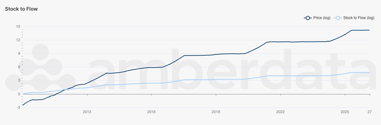
Bitcoin Stock to Flow Price Prediction
In traditional markets, economists have looked at stock-to-flow models to price and evaluate commodities:
- stock: existing stock of a commodity
- flow: new annual supply of the same commodity
The relationship between the two is called the stock-to-flow ratio and can be used to quantify the scarcity of a commodity. Gold and silver have the highest stock-to-flow ratio among all precious metals, way above the next top commodities (palladium and platinum). Leveraging the relationship between stock and flow and plotting historical data using linear regression it’s possible to estimate where the price of Bitcoin is headed in the future. Stock-to-flow can be used as a model for price as a function of the Bitcoin production rate and the forecast for yearly production.
Market Sentiment Indicators
Realized Price

Bitcoin log Realized Price to log Market Price
As the driver for realized cap, the realized price is the average cost basis of UTXOs. As the realized price moves above the market price, network participants are at an average loss (the cost basis is higher than the market price). But as the market price outpaces the realized price, the network average cost basis is now in a profit. The higher the gap between the two prices, the higher the realized gain or loss is for network participants. Historically, this metric has been used as a support sign, where participants would rather hold tokens than sell tokens at a loss, so a realized price less than the market price is often a market cycle bottom.
This metric is not without its trade-offs. The network contains several “Lost Coins” (or “inactive funds”) that can no longer be accessed for a multitude of reasons (such as a lost private key, funds sent to the wrong address, hardware wallet lost in a tragic yacht accident, etc.), and these coins typically have a low-cost basis.
Net Unrealized Profit/Loss (NUPL)
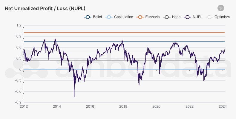
Bitcoin Net Unrealized Profit/Loss (NUPL)
he Net Unrealized Profit/Loss is a difference between realized cap and market cap, with realized cap being the value of every coin at the last time it moved. In other words, the Net Unrealized Profit/Loss (NUPL) represents the net profit or loss that would be realized if every coin was sold – paper profit/losses.
This metric can best be interpreted as an indicator of investor sentiment, where the Relative NUPL (NUPL divided by market cap) is visualized among various bands. When the metric is above 1, for example, sentiment is generally in a state of “euphoria.” Currently, BTC sentiment is in a state of optimism.
Given the metric utilizes the realized cap (which is based on the realized price), this metric is subject to similar biases with lost and inactive coins.
HODLer Net Position Change
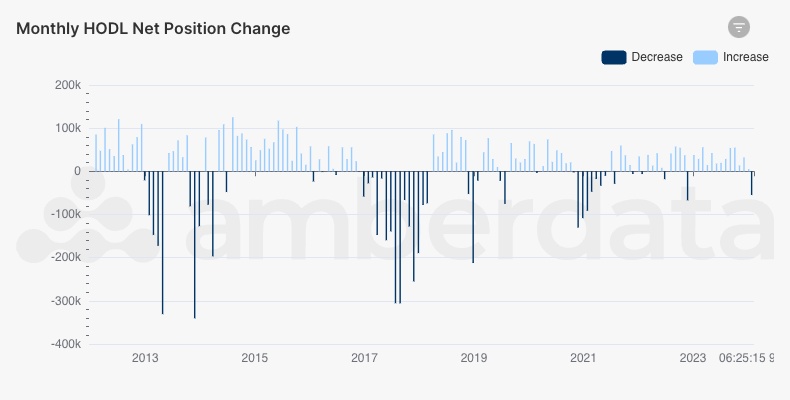
Bitcoin HODLer Net Position Change
Bitcoin HODLer Net Position Change is a measure of position change for HODLers (users who hold tokens for a long period). During bull markets, HODLer Net Position Change drops as larger positions are cashed out and new positions are accumulated. The metric increases as HODLers accumulate positions, often in bear markets. Tracking HODLer’s movement is unique to digital assets and this metric shows the sentiment of long-term HODLers who tend to hold and accumulate during bear markets and sell during bull markets to realize gains.
Liquid vs Illiquid Supply
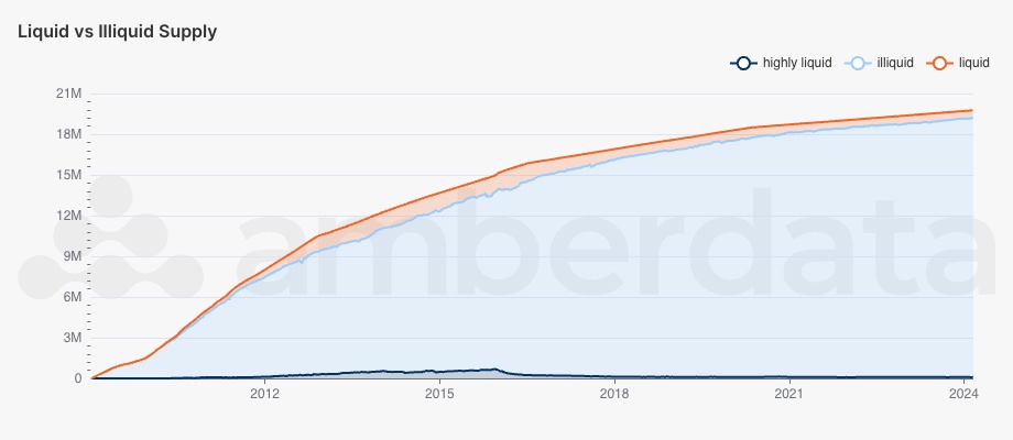
Bitcoin Liquid vs Illiquid Supply
With the HODL metrics previously mentioned, another methodology is to keep track of how the supply of Bitcoin has been changing over time. As addresses HODL tokens, their liquidity preferences (ratio of their cumulative inputs and outputs) adjust over time. Illiquid tokens are those held by addresses that have historically accumulated tokens (inputs far exceed outputs), while highly liquid tokens are held by addresses that have historically kept tokens fluid (high ratio of outputs to inputs). This metric is subject to similar biases with lost and inactive coins and is heavily weighted by old and inactive addresses (such as Satoshi’s address).
User Activity Indicators
Active Addresses
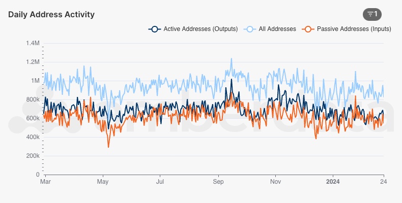
Daily Bitcoin Addresses: all addresses, active addresses, and passive addresses
Address activity is one of the best health indicators for any network, and Bitcoin’s active and passive addresses are strong signs of a thriving blockchain. Active addresses are “sending” addresses – addresses that create an output on a given day requiring a signature to move funds. Passive addresses, on the other hand, do not require any action to be taken and can passively receive funds – these addresses are inputs to transactions on a given day. “All addresses” in this case is the distinct number of addresses that have either sent or received funds in a given day – addresses on either side of a transaction input or output.
New Address Momentum
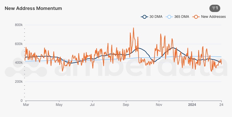
Bitcoin new address momentum
In addition to wallet address activity, new addresses support the development of the network by bringing additional liquidity and accessibility. Using the 30-day moving average (30DMA) and 365-day moving average (365DMA), trendlines between long-term momentum and short-term momentum can provide insights into on-chain activity levels. When the 30DMA is greater than the 365DMA, activity indicates a positive trend in usage. As the gap widens between the two, the network can either be in a growth stage or an accumulation stage with users returning rather than new users entering the network.
Address Balance Buckets (BTC)
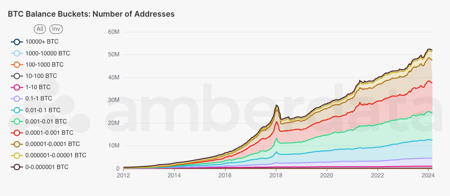
Bitcoin address balance buckets for the number of addresses in each bucket
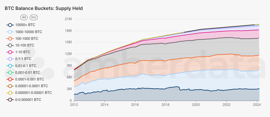
Bitcoin address balance buckets for the total supply of BTC held in each bucket
Address balances provide a wealth of insights into how addresses are accumulating funds. While the number of addresses has steadily climbed throughout the years, using balance buckets it’s evident that the growth has primarily been in the 0.000001 - 0.1 BTC ranges (green, red, burgundy, and light blue). With BTC prices also climbing, this range likely represents a “middle-class” tier of users and is likely to include both retail and institutional investor interests. The main metric to keep track of here is the growth of addresses on the higher end, as this represents a significant growth in the supply accumulation.
Address Balance Buckets (USD)
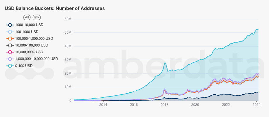
Bitcoin address balance buckets for balances held in USD
Utilizing a similar methodology, categorizing these buckets in USD values is extremely helpful to level set and maintain comparables to other networks. Since 2020, the smallest bucket has gained a significant amount of traction but likely this can be chalked up to account dusting (small amounts of tokens sent to addresses for a variety of reasons).
As the price of BTC fluctuates, it is extremely common for addresses to move from one bucket to another without having made any actions. As BTC price increases the number of addresses at the top tends to increase, while the opposite is true – when BTC price decreases the number of addresses in the highest buckets tends to decrease. This visualization is still highly informative though as it casts a trend into address activity during different stages of the cycle – when BTC prices are low addresses tend to accumulate more and are more likely to move up the stack when prices move back upward.
HODL Waves
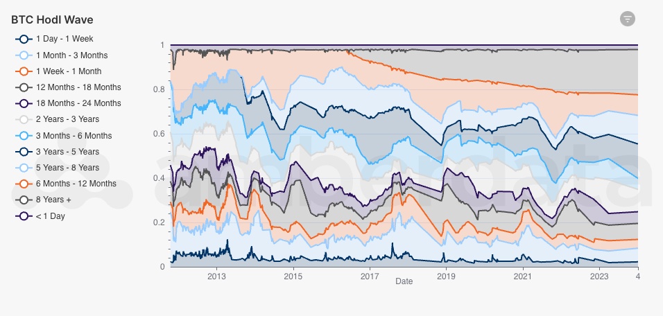
Bitcoin address balance buckets for balances held in USD
Bitcoin HODL waves can also help understand the trends in network user behaviors, showing the amount of Bitcoin in circulation grouped into ages. These various age bands show trends in how network participants utilize Bitcoin with more recent bands (i.e., 1 Day - 1 Week) representing tokens that are freshly minted or move quickly, while older bands (i.e., 8+ Years) represent tokens that have not moved in a long time. As the older bands compress, long-term holders sell their tokens which then moves them into short-term bands, while older bands growing in size represent continued holding patterns and token accumulation.
Short-term bands tend to spike during periods of price momentum as holders sell to realize profits moving tokens from older bands into more recent ones, while long-term bands slowly grow as the network holds for longer during periods of declining prices.
Miner Metrics
Puell Multiple
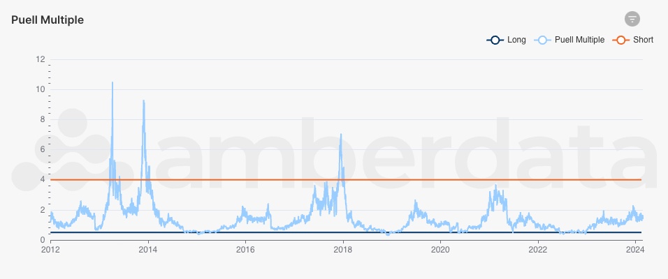
Bitcoin Puell Multiple
The Puell Multiple is an indicator of miner profitability, which reflects price movements and helps to determine market cycles. While many of the metrics previously shown are built on prices, user activity, or transactions, the Puell Multiple is a macro market sentiment indicator focused on miners. When miners’ daily revenues (USD value of daily issuance) are significantly higher than historical values (365DMA issuance), historically BTC reaches a major high. Said differently, as the Puell Multiple moves higher relative to historical values (multiple between 4.0 and 8.0), BTC prices reach new peaks – conversely, as the multiple sits low relative to historical values (multiple less than 0.6), the price of BTC may be preparing to bounce. A multiple of 1.0 indicates that miners are profitable, whereas a value less than 1.0 represents miner loss.
Percentage of Bitcoin Sold/Accumulated by Miners
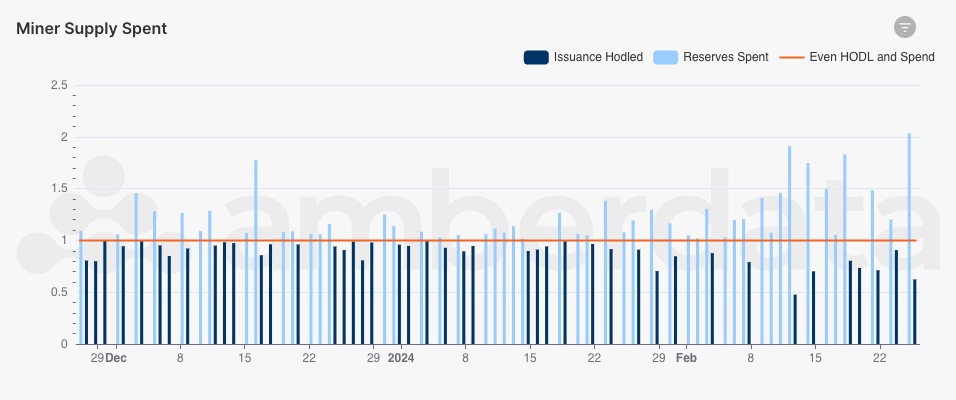
Bitcoin Miner Supply Spent
Miner supply change, lastly, signals the spending activity of miners relative to their issuance. As miners accumulate more BTC through mining rewards, they face pressure to sell to pay expenses. This selling pressure brings the new token supply to the market in the form of new BTC liquidity – an incredibly important feature of the network that allows miners to realize profit and allows the market access to newly minted tokens. Historically, miners have been on the selling side during BTC price growth as they can realize returns rather than accumulate for future profits.
Conclusion
In conclusion, Bitcoin metrics provide essential insights for financial institutions to conduct research, assess market trends, and create trading strategies. As interest in Bitcoin continues to grow through spot ETFs and retail users, understanding the forces driving its market behavior becomes increasingly important.
Available through the AmberLens market intelligence platform, Amberdata’s Institutional Bitcoin Market Indicators boasts a comprehensive set of metrics built on deep and granular digital asset data. These indicators cover various aspects of the market, including price trends, investor sentiment, user activity, and miner metrics.
From tracking price movements using indicators like Moving Averages, Pi Cycle Top Indicator, and Realized Cap to assessing investor sentiment through metrics like MVRV Z-Score, Reserve Risk, and HODLer Net Position Change, Amberdata's Bitcoin Market Indicators provide a multifaceted view of the market landscape. Additionally, user activity indicators such as Active Addresses, New Address Momentum, and Address Balance Buckets offer valuable insights into network usage and adoption trends.
Furthermore, miner metrics like the Puell Multiple and Percentage of Bitcoin Sold/Accumulated by Miners offer unique perspectives on miner profitability and supply dynamics, shedding light on the underlying forces shaping Bitcoin's market cycles.
Institutions can utilize these indicators to enhance their research capabilities, optimize asset management strategies, and make informed trading decisions in the dynamic and evolving landscape of the Bitcoin market. By staying ahead of market trends and leveraging data-driven insights, financial institutions can navigate the complexities of the Bitcoin market with confidence and precision.
AMBERDATA DISCLAIMER: The information provided in this research is for educational purposes only and is not investment or financial advice. Please do your research before making any investment decisions. None of the information in this report constitutes or should be relied on as a suggestion, offer, or other solicitation to engage in or refrain from engaging, in any purchase, sale, or any other investment-related activity. Cryptocurrency investments are volatile and high-risk in nature. Don't invest more than what you can afford to lose.
