Share this blog:

Cryptocurrencies are emerging as a new asset class and have attracted the attention of institutional and retail investors. There is some additional complexity to overcome however, much of what you know about traditional financial markets apply.
In the following posts, we will show you how to get access to the data and apply financial fundamentals to quantify opportunity and risk.
I work at Amberdata so we are going to use our APIs. Amberdata solves a fundamental data infrastructure problem for anyone building on blockchain or transacting in digital assets. You will need an API key to code along with us during this series of posts. To get started sign up for the OnDemand plan. Download the Jupyter Notebook here .
Let’s get some data. We are going to use Python, Jupyter Notebook and Amberdata’s API docs.
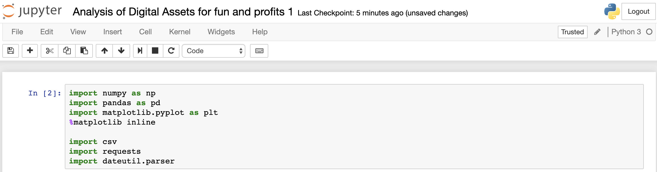
Let's define a function to make it easy to read in any historical market data we want to look at. You will need to replace “YOUR_API_KEY” with your API key in the headers section so you can get access to the data.
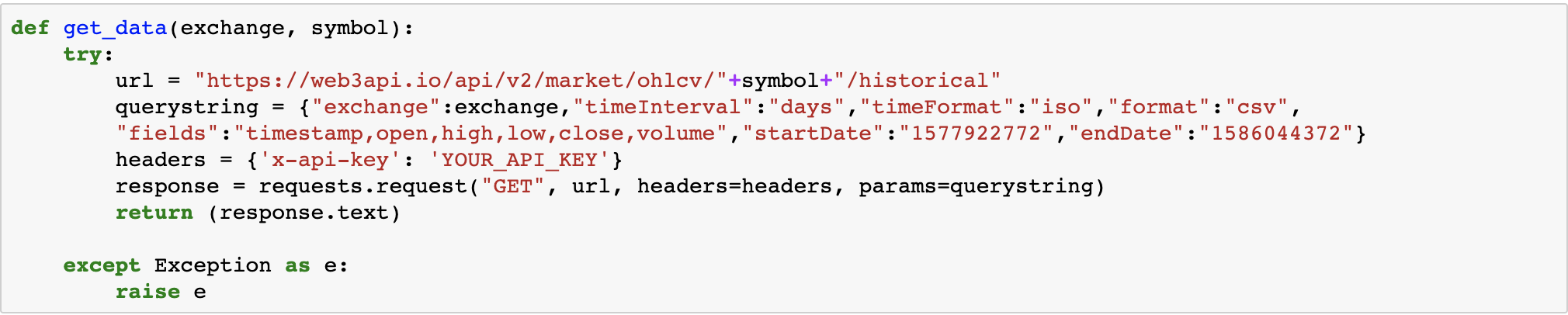
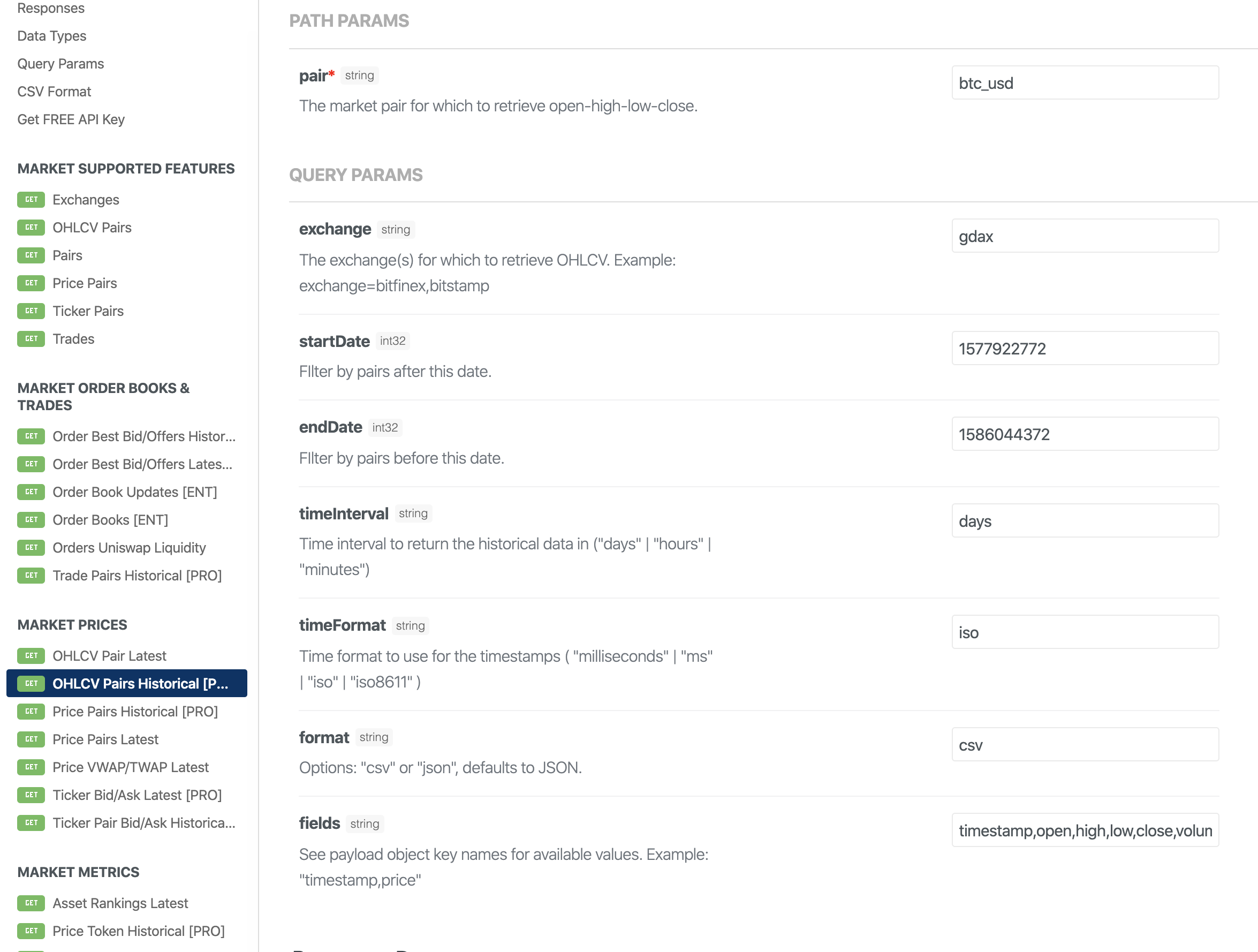
In this function, we call the get historical Open, High, Low, Close, Volume Endpoint as follows to pull in CoinbasePro historical data from Amberdata for the digital assets we are interested in.
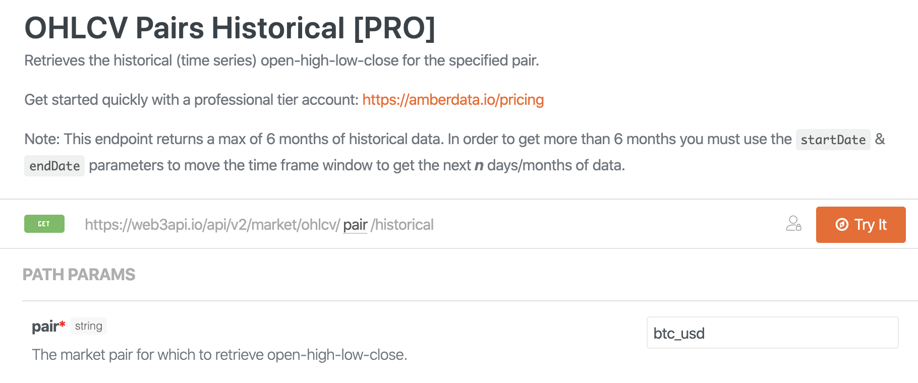
We will need to specify the pair we are interested in btc_usd for example. The exchange we would like to get historical data from. Here we will use Coinbase Pro (gdax). Next, we need to define how much data we want to look at in the startDate and endData params.
We will need to specify:
- The trading pair we are interested in (btc_usd)
- The exchange we are requesting historical data from CoinbasePro(gdax)
- How much data we will request using startDate and endDate.
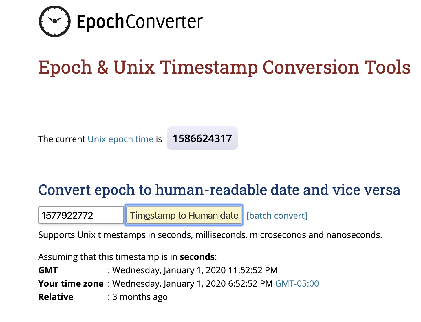
Don’t get lost on this step! You will need to convert standard Year:day:time into int32 Epoch time… This site is easy to use.
Let's use daily price data to keep our payload small. We will also format our timestamp in ISO so when we chart things we have a human-readable time series.
Lastly, let's specify we want our data to be returned in CSV format rather than JSON which makes it really easy for anyone to do analytics like they would on any other asset class such as stocks or commodities.
Our function defined above will send the following for each digital asset we are interested in to pull the historical market data.
import requestsurl = "https://web3api.io/api/v2/market/ohlcv/btc_usd/historical"querystring = {"exchange":"gdax","startDate":"1577922772","endDate":"1586044372","timeInterval":"days","timeFormat":"iso","format":"csv","fields":"timestamp,open,high,low,close,volume"}headers = {'x-api-key': 'YOUR_API_KEY'}response = requests.request("GET", url, headers=headers, params=querystring)print(response.text)Now let's figure out which digital assets to look at. We are going to focus on the most liquid assets to mitigate slippage or becoming a bag holder. At Amberdata we do some simple ranks which allow you to filter by whatever you like, as you refine your selection criteria. Below we have ranked by Liquid Market Cap, keeping us focused on where the action is at.

Digital Asset Rankings are also available via API https://docs.amberdata.io/reference#market-rankings
Let's keep our analysis simple and only look at the top 10 digital assets sorted by liquid market cap listed which trade on CoinbasePro and are USD denominated pairs so we don't have to deal with cross-exchange or cross-rates.
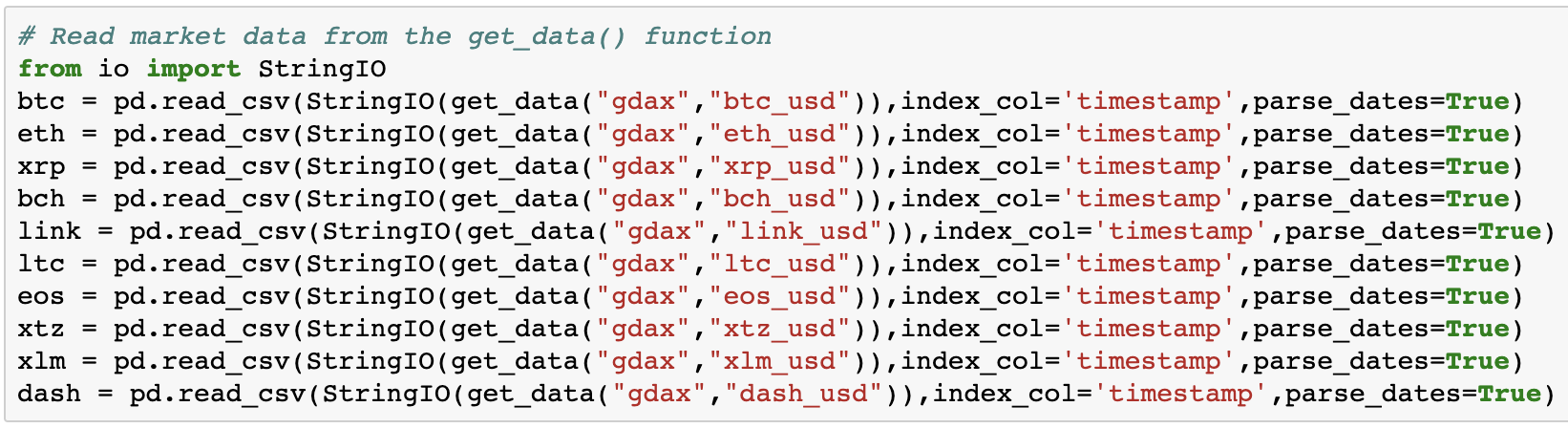
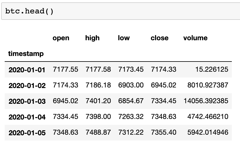
Now Let’s verify we have the data
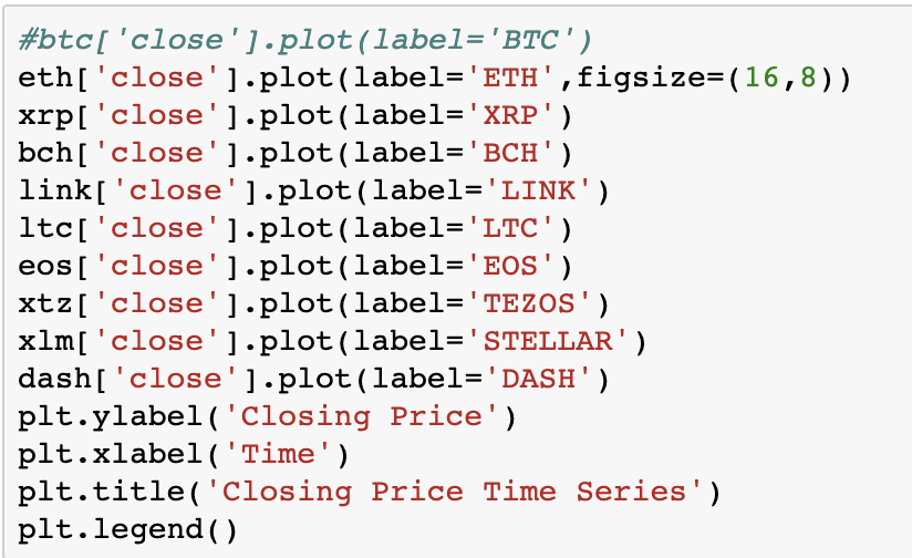
Now we will do a quick plot of the data to make sure things look as expected. Notice we have commented out btc_usd so we can see others on the chart here.
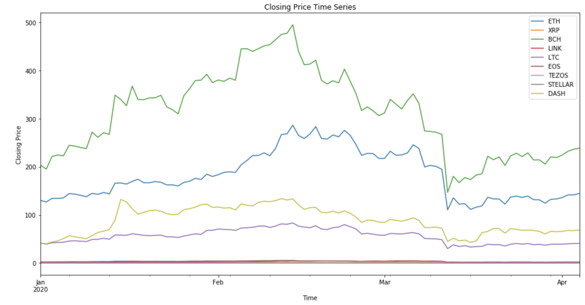
Now with the data loaded we can start to ask some questions and test any thesis we may have about a particular digital asset or a portfolio of them.
Which of these had the highest trading volume on CoinbasePro for the period of interest?
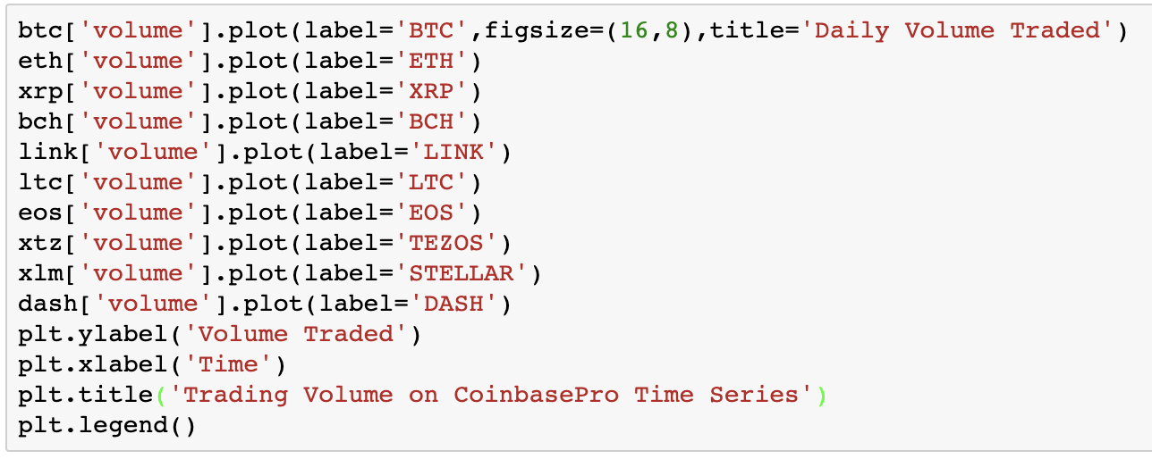
We were surprised to see XRP and Stellars trading volume exceeding the larger cap digital assets.
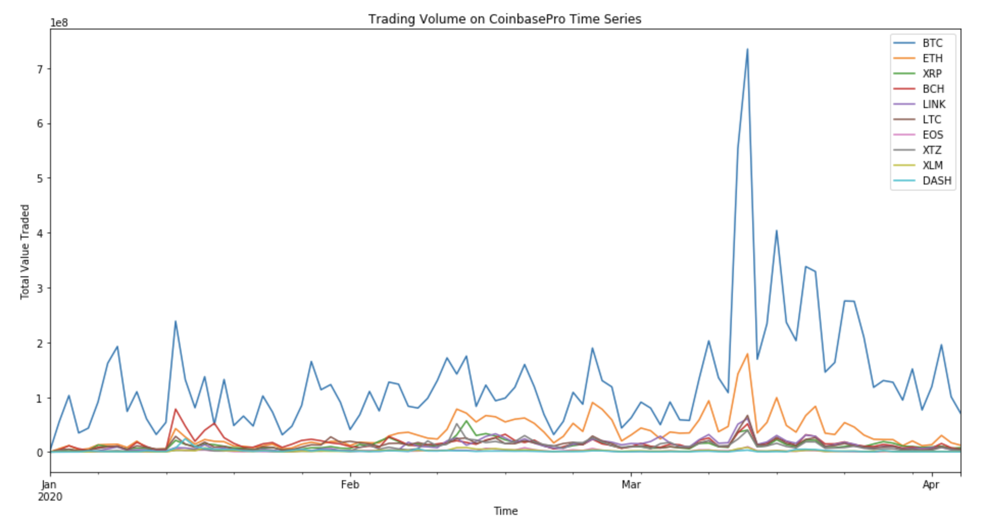
How much value in USD was traded per day in each of these digital assets?
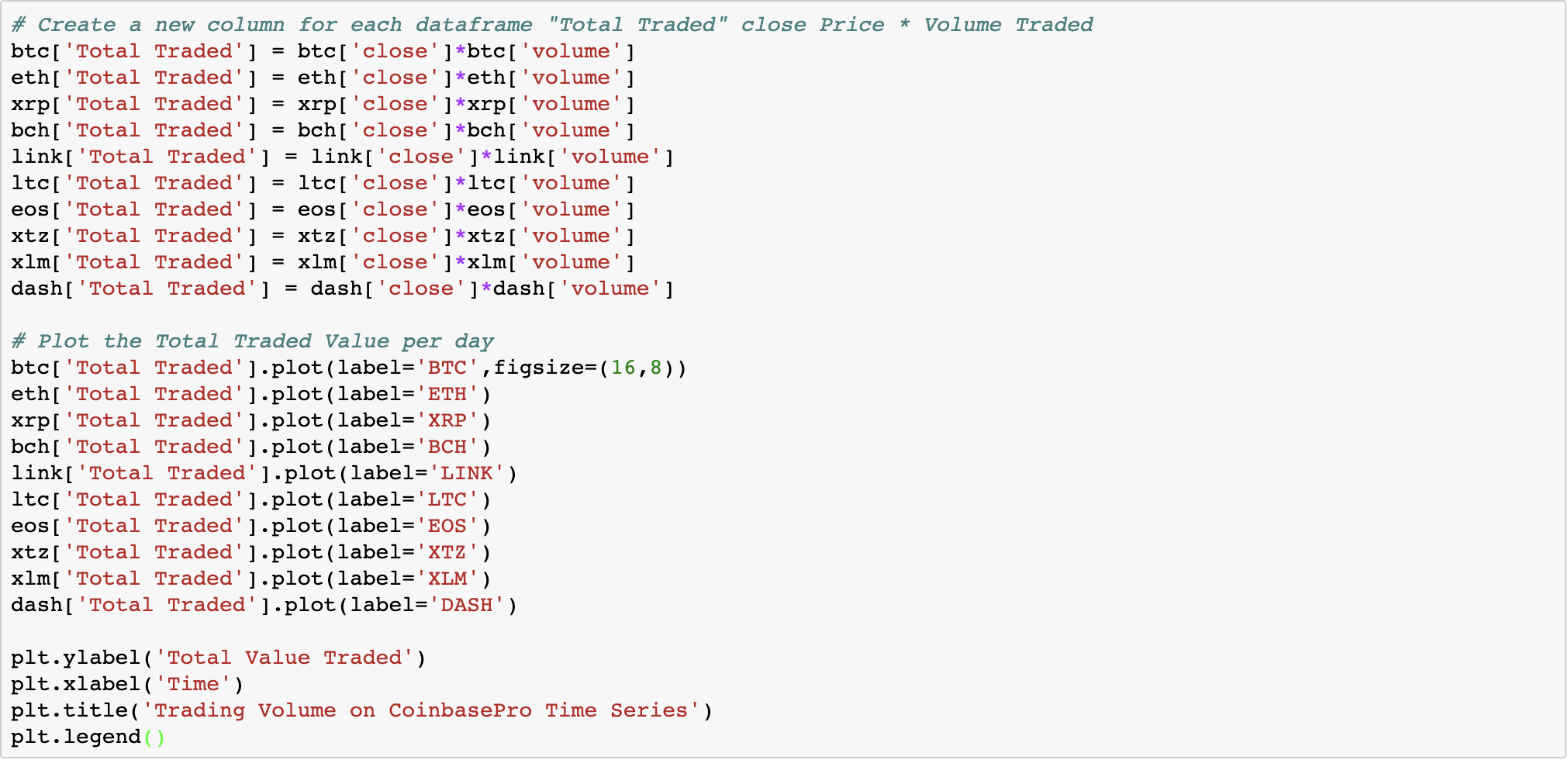
Looking at the total value traded for each of these, confirmed our expectations that BTC and ETH represent the majority of value transacted on Coinbase Pro.
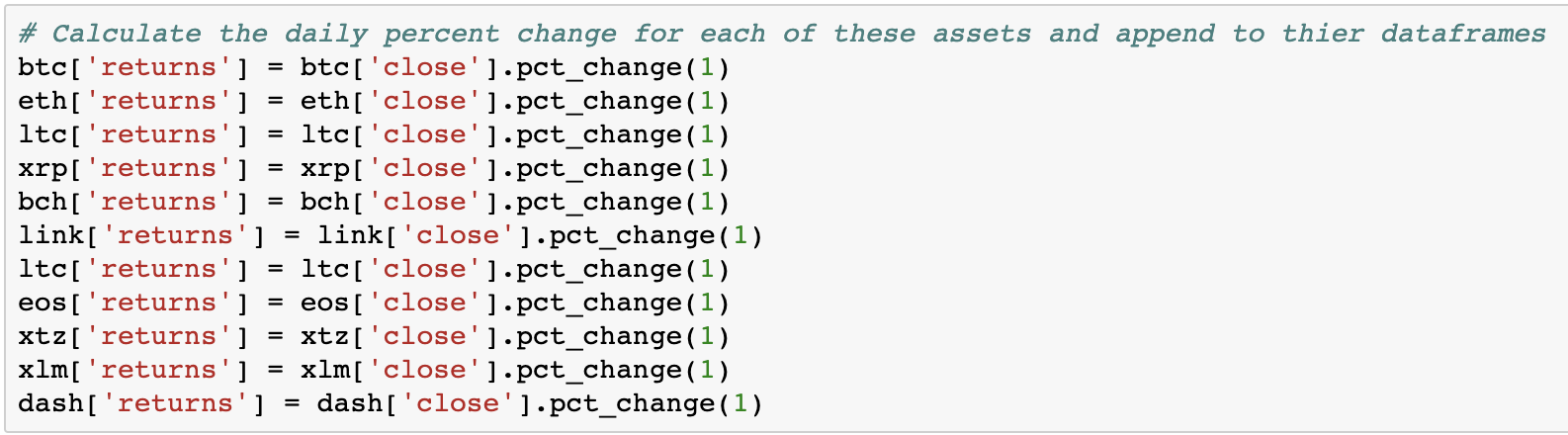
Now we will calculate the daily percent change for each of these assets building a time series of daily returns.
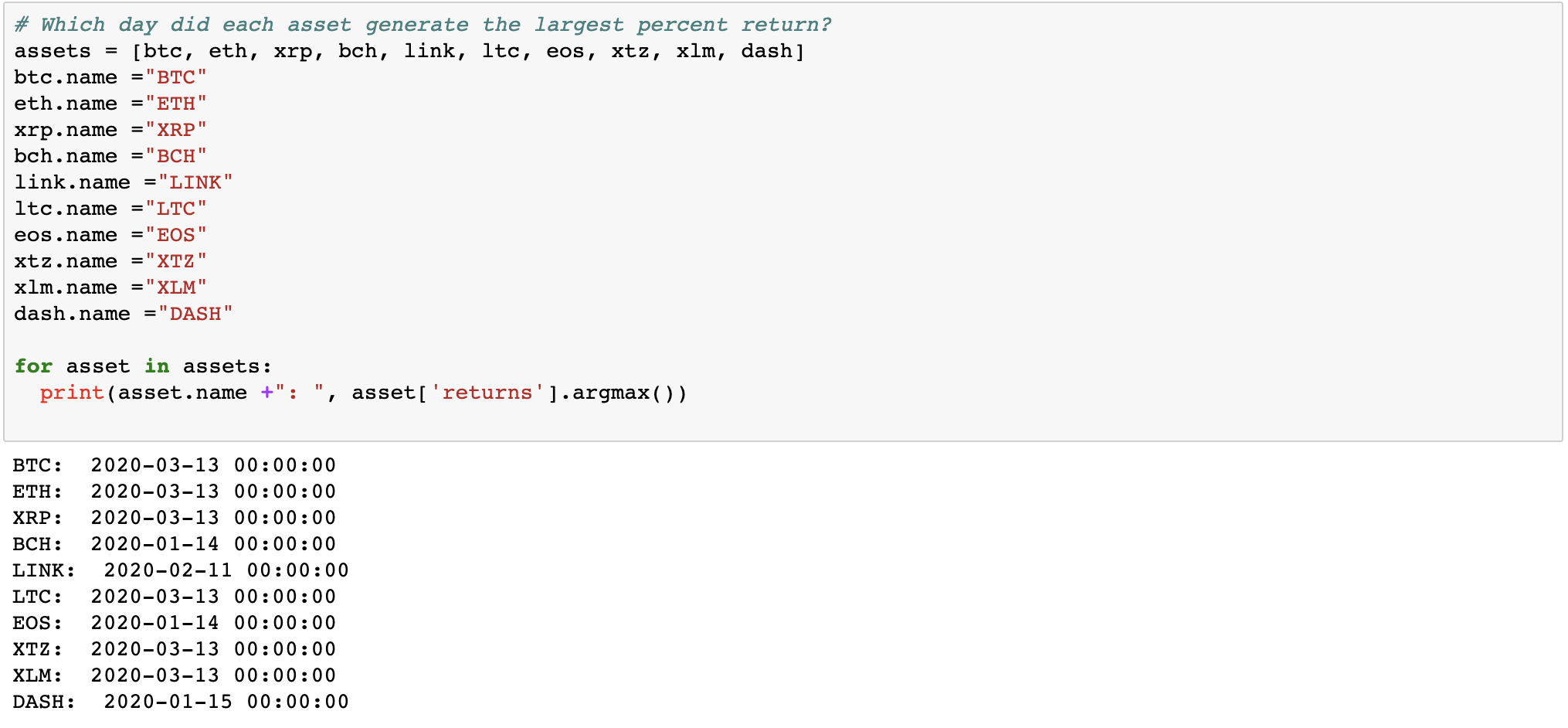
So which day did each asset generate the largest returns?
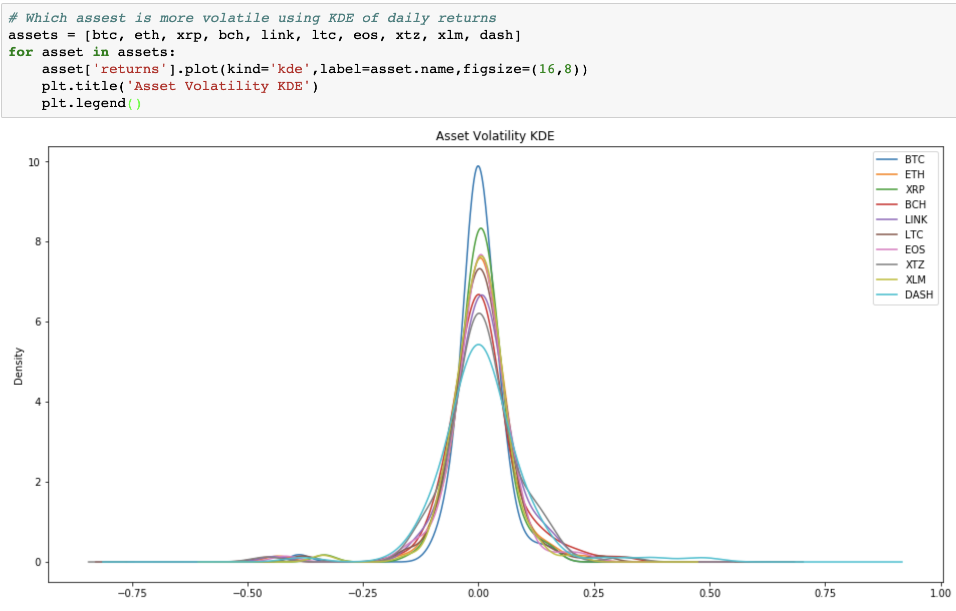
Next let's compare the volatility of each asset using the distribution of daily returns in a kernel density estimation (KDE)
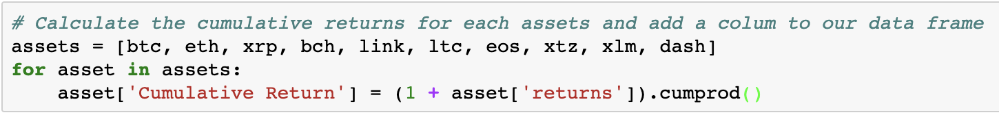
We are getting a feel for each of our digital assets of interest here, now lets look at their cumulative returns for each during the holding period.
Which asset performed the best overall, is pretty easy to determine as well.
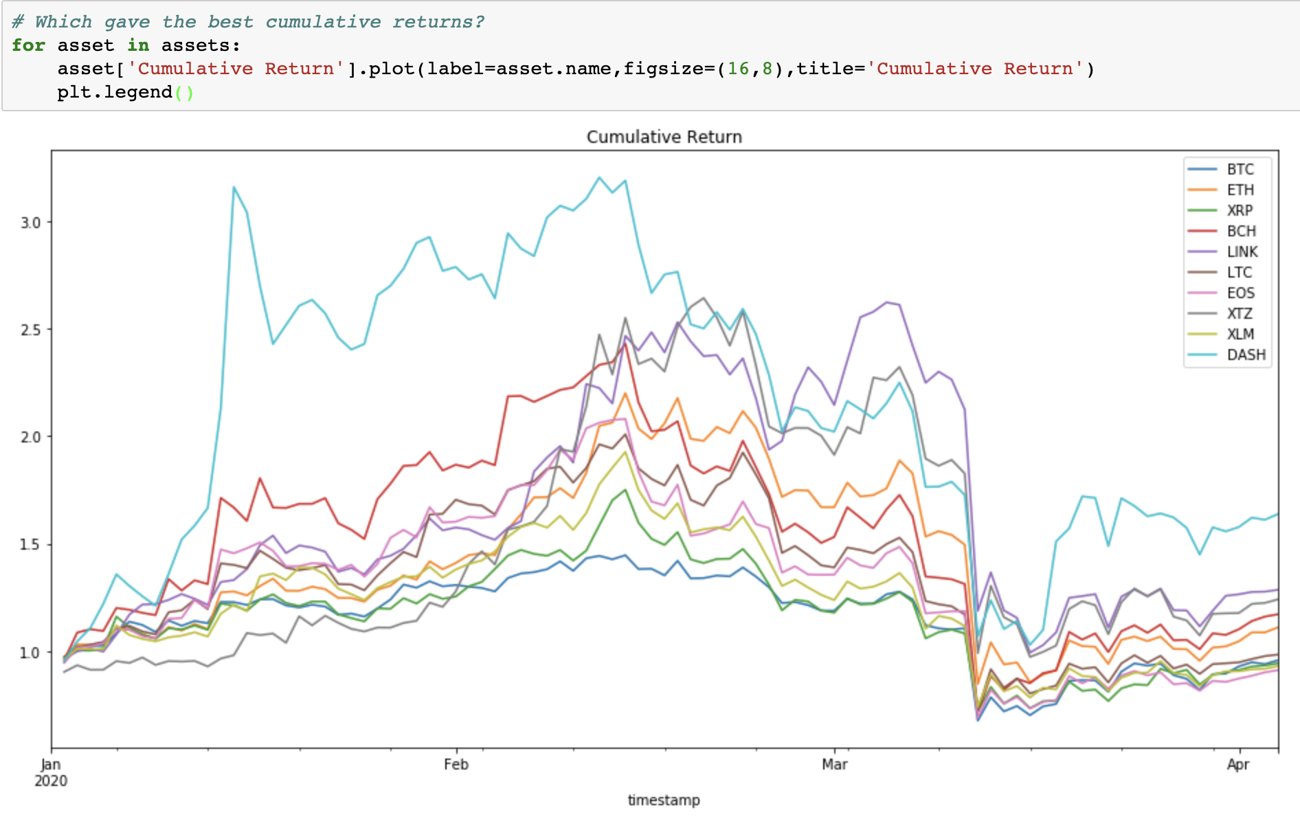
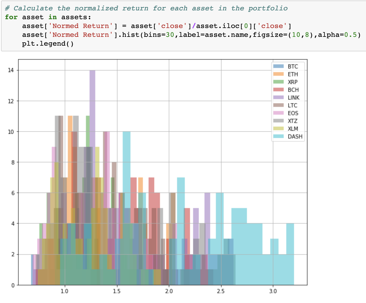
Dash appears to have provided the best cumulative returns for this period. How much volatility did you have to endure though? We will normalize the returns for each digital asset in our portfolio so we can compare it more thoroughly.
Now let's take a look at each asset’s Sharpe Ratio to see which has the best risk-adjusted returns. Sharpe Ratio simply subtracts the risk-free rate from the portfolio returns and divides that the standard deviation on the portfolio excess returns. Today interest rates are effectively zero so we are really just dividing returns by the standard deviation of returns.
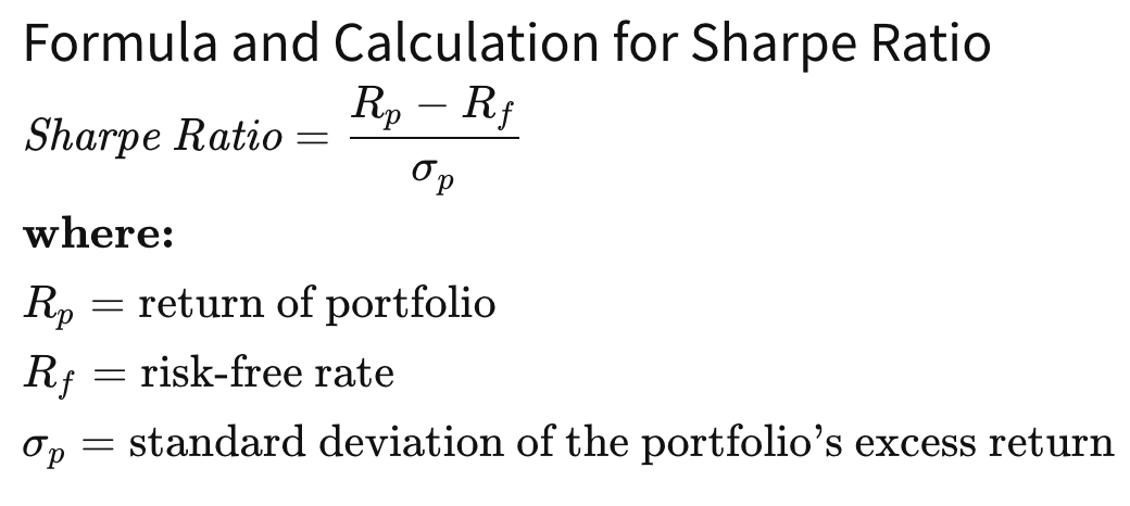
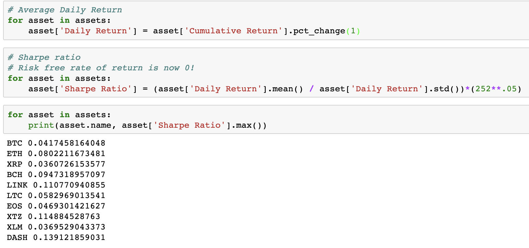
For the period we investigated, DASH had the best risk-adjusted returns. Knowing the Shape ratio of an asset enables you to understand historical profits adjusted for the risk to generate those returns. In future posts, we will build and optimize a portfolio of digital assets.
In this post, we learned how to do some basic analysis of digital asset market data using Amberdata’s APIs and Jupyter Notebook. Signup for our API and stay watch for our next post to help you unlock digital assets data. Download the Jupyter Notebook here